


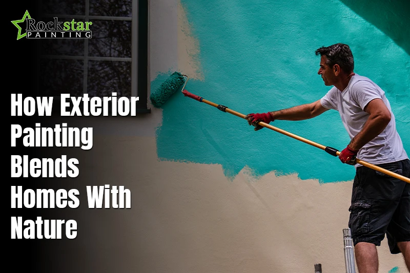
Exterior color choices guide how a home feels outdoors in every season. Many owners want calm looks that fit the land and light. Exterior painting blends homes with nature when shades reflect trees, soil, sky, and sun. This approach supports balance, comfort, and steady curb appeal. Homes feel grounded instead of loud against open views. Now lets see how simple color choices guide design and support long-term visual ease.
Exterior design works best when land and walls feel connected. Winter shades home interiors blend homes with nature by using tones found nearby. These shades reduce glare and feel soft to the eyes. They age well through weather changes. Owners notice more warmth around paths, gardens, and walls. The home feels part of its setting. This method avoids trend chasing and supports timeless outdoor appeal.
Why Exterior Colors Matter in Natural Settings?

A home should feel like it belongs within its surroundings. Colors guide emotion, comfort, and first impressions outdoors. Exterior walls that clash can feel loud and uneasy. Soft choices help homes rest within nature. Exterior color psychology explains why calm tones feel right. They support peace, warmth, and visual ease. Light and shade work together. These effects shape how people connect with a place daily. Feeling at home starts with color choice.
Professional exterior painting with natural palettes helps homes blend with nearby land. They follow trees, soil, stone, and sky. This creates landscape color harmony across views. Balanced colors reflect light in gentle ways. Warm tones add comfort without stealing focus. You learn how nature-led choices build connection. This approach keeps homes calm, grounded, and lasting. Good color planning supports beauty through every season. It feels right each year.
1. How Nature Inspires Exterior Color Choices
Nature guides smart exterior color decisions every day. Land, water, trees, and light shape what feels right. Designers study views before choosing paint. This process explains how nature-inspired exterior colors emerge naturally. Homes feel calm and grounded outdoors. Colors echo the surroundings and avoid harsh contrast. This approach helps walls belong within the open space. It builds trust between the structure and the setting over time.
Colors Found in Natural Landscapes
Natural scenes offer clear color lessons for homes. Greens, browns, stone, grays, and sand tones appear often. These shades feel familiar to the eyes. They support balance with soil, wood, and rock nearby. Nature-inspired exterior colors reduce glare. They soften edges under the strong sun. This method keeps homes settled within the land. Painters use these cues to guide steady outdoor choices for lasting harmony.

Why Natural Palettes Feel Timeless?
Soft contrast helps homes age well outdoors. Loud shades fade in appeal quickly. Natural color palettes stay steady through the years. They create visual calm and organic appeal. Walls feel warm, not forced. Light shifts do not break harmony. This keeps curb appeal strong. Owners feel peace seeing their home daily. This lasting quality supports confident choices across seasons and changing tastes without stress.
2. Creating Harmony Between Home and Landscape
A home feels right when it fits its outdoor space. Color plays a major role here. Home and landscape integration starts with careful viewing of the land. Trees, gardens, terrain, and sky guide paint choices. When walls reflect nearby tones, the home feels calm. This harmony reduces visual stress and builds balance. Owners often feel pride seeing a home that belongs outdoors. The setting feels planned yet natural through every season.
Matching Exterior Colors to Surroundings
Outdoor spaces offer clear color cues for walls. Trees bring green depth and shade. Gardens add soft, natural hues. Terrain gives earth-based tones like clay or stone. Sky light shifts color through the day. Matching these tones supports outdoor color coordination. Walls feel tied to the land instead of standing apart. This method keeps views gentle and steady. It also helps paint well in the sun and weather.
Blending Architecture With the Environment
Good color flow links buildings with outdoor areas. Paths, fences, and walls feel connected. Architecture looks calmer within an open space. Outdoor color coordination avoids sharp contrast. Soft flow supports natural movement for the eye. Homes feel settled within land. This blend creates trust, comfort, and lasting outdoor appeal. It helps spaces feel whole rather than separate over time.
3. Earth Tones and Organic Exterior Design

Earth tones help homes feel calm and settled outdoors. Earth tone exteriors reflect colors seen in soil, stone, and wood. These shades work well in many settings. They reduce harsh contrast with the land. Homes appear stable and welcoming. Fresh paint increases value by enhancing curb appeal and signaling care. This style supports long-term outdoor comfort. Owners often feel peace seeing walls blend with nature daily. Earth tones also age well through weather changes. They support steady curb appeal without strong shifts in style.
Popular Earth Tones for Exteriors
Nature offers many useful color ideas for walls. Clay tones feel warm and rich. Taupe adds soft balance. Olive connects homes with plants and trees. Charcoal supports depth and calm strength. Sandstone reflects light in gentle ways. These colors support organic exterior design by staying close to land tones. They feel familiar to the eyes. Painters use these shades to guide natural-looking results outdoors.
Why Earth Tones Feel Grounded
Earth tones suggest stability and warmth. They connect homes to land and space. Organic exterior design avoids loud contrast. Soft tones help walls feel rooted. Light changes do not break harmony. This creates trust and comfort. Homes feel part of their setting. This grounded feel supports lasting beauty across seasons.
4. Exterior Color Psychology and Natural Balance
Exterior color psychology explains how outdoor colors shape feeling and comfort. Soft tones bring calm and ease to views. Warm shades add welcome without noise. Dark tones add depth and strength. When colors feel natural, the space feels open. Balance supports trust and peace outdoors. This approach helps homes feel settled within nature. The eye rests with ease across walls and land.
How Colors Affect Outdoor Perception
Colors change how people read outdoor spaces. Light tones feel open and calm. Warm shades feel friendly and safe. Dark shades add weight and form. These effects guide smart choices. When used well, they support color balance outdoors. Views feel steady and clear. Homes appear planned, not loud. This supports daily comfort and strong curb appeal.

Choosing Colors That Feel Natural, Not Forced
Natural choices avoid harsh contrast and visual noise. Strong shifts can feel tense outdoors. Soft flow keeps harmony strong. Walls blend with land and light. This supports color balance outdoors over time. The home feels part of its place. Calm choices last longer. They support beauty without effort through changing seasons.
5. Using Light and Environment to Guide Color Selection
Light and setting guide smart exterior color choices. Sun direction changes how paint appears daily. Natural light reflection helps walls feel soft and calm. Morning light feels cool and gentle. Midday light feels bright and strong. Evening light feels warm and deep. Shade from trees changes the tone depth. These shifts shape how colors feel outdoors. Good planning respects these changes. Homes look balanced across hours and seasons.
Sunlight Shade and Natural Reflection
Sunlight affects every surface outside when you paint stunning wall murals. Morning light softens walls. Shadows add contrast and depth. Seasonal shifts change brightness and warmth. Natural reflection from land also matters. Grass, sand, and stone bounce light upward. This impacts the wall color appearance. Painters study these effects first. This supports steady results outdoors. Colors stay calm under varied light.
How Natural Light Changes Exterior Colors?
Light changes tone, depth, and warmth. Bright light can wash colors out. Shade can deepen hues. Soft light adds visual softness. Environmental aesthetics depend on this balance. Natural choices avoid glare and strain. Walls feel gentle to the eyes. The home fits its space. This method supports lasting harmony through changing light.
6. Regional Nature-Inspired Color Palettes
Regions shape how exterior colors feel outdoors. Climate, light, and land guide smart choices. Coastal color palettes suit open, bright settings near water. Other regions need deeper tones for balance. Using local cues helps homes feel natural. This method avoids forced style. Homes look settled within their region. Color choices feel honest and lasting.
Coastal Exterior Color Influence
Coastal homes reflect light air and open views. Soft blues, whites, and driftwood tones work well here. These shades reduce glare from the sun and water. They feel calm and fresh. Walls stay light without feeling harsh. Coastal color palettes support relaxed outdoor views. Homes feel easy and breathable near shore settings.
Forest Desert And Mountain Palettes
Land types guide stronger tone choices. forest-inspired colors use greens, browns, and deep shade tones. Desert color schemes favor warm neutrals and sand hues. Mountain homes lean toward stone-inspired shades. These palettes support balance with the land. Homes feel grounded and connected. This approach keeps color choices steady across regions.
7. Sustainable and Eco-Inspired Exterior Aesthetics
More homeowners want colors that match nature and make them feel relaxed outdoors. Eco-friendly color choices support this goal with a soft visual impact. Muted tones reduce strain on eyes and vision. Homes feel gentle within land and light.

This style avoids loud contrast. It supports balance and long-term appeal. People value choices that feel thoughtful and steady. Nature-driven design helps homes age well. It builds trust between the space and the setting.
Nature Driven Design Choices
Nature-driven design uses quiet tones from the land and plants. These colors feel familiar and easy. Low-impact visuals keep viewers calm. Walls blend with the soil, stone, and trees through affordable commercial painting approaches. This method avoids strong focus points. Homes feel part of the space. The result feels natural and clear through seasons.
Why Eco Aesthetics Are Growing?
Environmental care shapes design decisions today. Sustainable design influence supports harmony and restraint. Owners seek calm beauty without excess. Eco aesthetics meet this need. They support peace outdoors and visual comfort. This trend continues as awareness grows.
8. How Exterior Colors Enhance Curb Appeal Naturally
Curb appeal feels strongest when colors work with nature. Soft choices help homes feel calm and inviting. Curb appeal color ideas often come from nearby land. Subtle contrast feels easier on the eyes. Loud shades can feel forced outdoors. Natural balance helps homes feel welcoming. This approach supports beauty without stress. Visitors notice harmony before bold detail. The home feels settled and cared for.
Subtle Contrast vs Bold Statements
Subtle contrast blends walls with land and light. It supports gentle visual flow. Bold shades demand attention and break the balance. Outdoors, this can feel tense. Blending tones feels more natural. This method respects natural surroundings. Homes feel part of a place. Views stay calm and pleasing. Subtle contrast lasts longer in appeal.
Creating a Welcoming Outdoor Presence
Warm tones and soft flow create comfort. Balance helps spaces feel open and friendly. Colors guide eyes with ease. Natural flow supports trust and calm. The home feels ready to welcome guests. This style works across seasons. It keeps curb appeal steady and natural.
Conclusion
At Rockstar Painting Denver, homes feel right when colors respect the land, light, and mood. Exterior choices guide emotion and comfort outdoors. Landscape color harmony helps walls feel calm and settled. Balanced tones reduce noise and stress. The home feels part of its space. This connection supports trust, warmth, and daily ease. People sense belonging through color without effort. Nature guides what feels honest and lasting.
Natural choices protect long-term beauty and appeal. nature inspired exterior colors age well through seasons. They support balance rather than short trends. Light shifts do not break their charm. Homes stay welcoming year after year. This approach blends design with the environment. When colors and nature align, the result feels timeless. Homes and surroundings speak together with quiet strength.
FAQs
Exterior colors blend homes with nature by matching land tones. Soft shades echo trees, soil, and sky. This creates calm balance outdoors and helps homes feel grounded within their surroundings year-round with natural ease.
Nature-inspired exterior color palettes include greens, browns, soft blues, and stone shades. These colors feel familiar to the eyes, reduce contrast outdoors, and support harmony across seasons while keeping curb appeal steady over time naturally.
Landscape affects exterior color choices through light and nearby features. Trees, soil, gardens, and sky guide tone selection. Following these cues improves outdoor balance and helps homes sit naturally within their environment with ease.
Earth tones remain popular because they feel stable and warm outdoors. These shades connect homes to land and materials. They reduce visual noise, support comfort, and age well across years without feeling dated or forced.
Natural light impacts exterior colors by changing tone, depth, and warmth. Bright sun softens hues while shade deepens color. Understanding this effect helps owners choose paints that stay balanced all day through shifting light now.