


Designers always know what looks best. This is what they do and what they are supposed to. They know how paint changes a space. They know which shades feel right and make each room feel calmer. This is why you must learn about designers’ favorite paint colors, because their ideas will help you get the exact look you want at home.
Why Designers Love Certain Paint Colors
Designers do not just think about the room. They also focus on the people who live there. They want the space to look warm and easy on the eyes. It is their job to keep it looking fresh. They pick colors that bring peace or joy into the room.
Some rooms need light tones that open up the area. Other rooms work better with warm or bold shades. They also look at where the light comes from. This makes a huge change in how paint looks. Designers use colors to shape how a room feels each day.
Top Interior Paint Colors Designers Recommend
The best paint colors have one thing in common, according to designers. They are soft and warm. But most importantly, they are easy to match with most items. Some popular ones include:
- Benjamin Moore Light Pewter: Calm, soft, and works well with wood or clean walls
- Classic Gray: Makes rooms feel large and high-end
- Pink with brown tones: Adds a rich, fresh, and earthy vibe
- Creamy whites: A warm base that now replaces stark white
These colors work well in many parts of the home.
How to Pick the Right Paint Finish for Walls & Trim

You must think about the look and the feel of the paint. These are the modern interior paint tips that pros always share. Match the paint finish with how the room will be used:
- Flat or matte is great for walls and hides marks well.
- Eggshell works well in rooms that need a soft look with a slight sheen.
- Satin or semi-gloss is best for trim and doors. Use it on spots you touch often.
- Flat finish is perfect for ceilings. It also helps hide surface flaws.
The right finish keeps paint strong and makes colors pop.
Don’t Just Rely on Swatches
Here’s what to do instead. If you want real results, do not trust store swatches. Here is some professional paint color advice that saves time and cash.
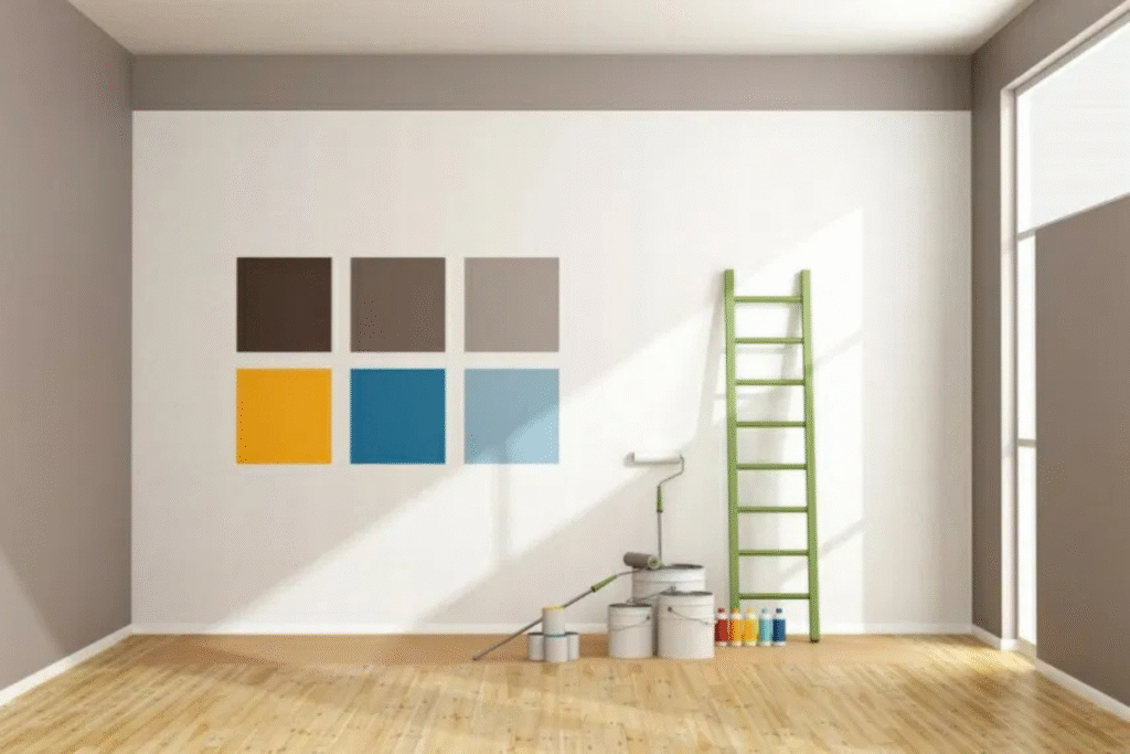
Try testing 2′ x 2′ patches directly on your home walls. Observe them during the day and at night. Check how they look with the lights on and then off. Place the samples near wood floors or trim to see the full effect. Also, view them next to your furniture.
Store lighting is not the same as home lighting. That is why swatches can be misleading.
Color Combinations That Always Work
Designers use some favorite paint shades for interiors to build a complete look without much effort. Reliable and proven pairs include:
- Beige + warm brass: Soft, warm, and feels both modern and classic
- Moody blue + wood tones: Cozy and bold, adds great depth
- Layered whites + soft pink: Clean, calm, and fresh
These combos reflect style and comfort, not just trends.
People Share What Worked in Their Homes
Some of the best paint colors, according to designers, come from real homes. User tips include:
- “We used Classic Gray for the den, and it feels rich.”
- “Moody green walls in the guest room made a huge splash.”
- “Two wall tones gave the room depth and kept it fresh.”
These stories show how good paint shades make a real change in homes.
Want Professional Results? Let Us Handle It
Need help with color? Our custom interior painting services can do the job. At Rockstar Painting, we help you find the right shade and finish. We prep walls, fix flaws, and add rich tones to each space. From the first coat to the last touch, we do it right.
Book your free call today and let us bring your dream to life.
Conclusion: A Great Color Can Change Everything
Only one small thing like paint, can change the full feel of your space. Warm tones add joy. Cool tones create a calm feeling. Bright shades wake you up. This one step turns old rooms into rich new ones. Use designers’ favorite paint colors, but trust your own eye too.
FAQ
Benjamin Moore Light Pewter, Classic Gray, Creamy whites and Pink with brown tones
Paint 2′ x 2′ patches on different walls in the room. Check them at different times of day to see how light affects the color. Compare each patch near your furniture, floor, and lighting for a true match.
Matte or eggshell is good for walls. Satin or semi-gloss works great for trim and doors
Yes. They give better depth, last longer, and look rich in tone.
Yes. Deep blue, moody green, or pink-brown shades feel bold yet calm.
You can use semi-gloss paint for kitchen cabinets and doors. It resists marks and cleans up with ease.
No. Use flat on ceilings and satin on trim. For walls, go with eggshell.
Yes. It hides flaws and gives a clean, smooth look.
Yes. The cool gray pairs well with warm whites and wood tones.
It depends. The same color feels clean, and a contrast makes it stand out.
Use soft whites like Chantilly Lace or Simply White by Benjamin Moore.