


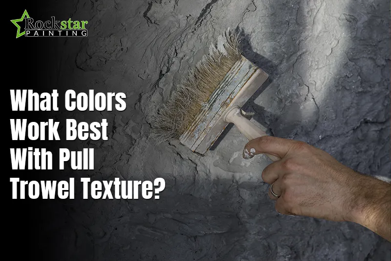
Pull trowel texture adds depth and movement to any room. It creates soft shadows that change with light. Choosing paint colors matters more with textured walls. The wrong shade can hide detail or feel heavy. The best with pull trowel texture colors help texture stand out. They support balance and warmth in living spaces. Color choice shapes mood and flow. Walls should feel calm, not busy. Texture deserves color that works with it, not against it.
Many homeowners struggle when selecting colors for textured walls. Flat choices can feel dull on raised surfaces, while very bold shades may appear harsh or uneven. This is where careful planning makes a difference. Pull trowel texture guide shows how the best color choices enhance depth without overpowering the design. Paint behaves differently on textured drywall than on smooth surfaces. Light hits raised areas first, while shadows deepen tones in lower areas. Understanding this interaction helps prevent disappointing results and ensures a polished finish.
This guide shares clear advice for textured walls. You will learn how color supports texture style. We explore modern wall textures and real interior wall design ideas. You will see how tone creates balance. We also explain feature wall colors that feel natural. The goal is simple results with lasting appeal. With the right plan, textured walls feel refined. Smart color choices bring out detail and character.
Why Color Choice Matters with Pull Trowel Texture?

Enhance Depth and Dimension
Color plays a major role on textured surfaces like pull trowel walls. Texture creates natural highs and lows across the wall. Paint reacts to light differently on raised areas. Lighter shades reflect light and reveal surface detail clearly. This effect helps the texture feel balanced and refined. Dark shades may hide detail or feel heavy. Choosing the best colors for textured walls keeps depth visible.
Soft neutrals often work well with texture. They allow shadows to add movement without distraction. Wall texture colors should support the pattern, not compete with it. Pull trowel texture looks best when the detail stays clear. Light tones prevent visual clutter in smaller rooms. They also keep the walls feeling open. Good color choice turns texture into a design feature. A poor choice can flatten the surface effect. Color controls how texture is seen each day.
Set Mood and Ambiance
Color also shapes how a room feels emotionally. Warm tones create comfort and calm. They suit bedrooms, living rooms, and dining areas. Cool tones feel clean and open. They work well in kitchens and modern spaces. An interior wall color guide helps match tone to purpose.
Color combinations for walls should feel balanced. Texture already adds movement, so colors should stay calm. Soft warm shades add warmth without crowding. Light cool shades support airy spaces. Mood comes from tone, not just texture. Smart color planning makes rooms feel right.
Popular Colors for Pull Trowel Texture Walls
Neutral Colors
Neutral shades remain a trusted choice for textured walls. White, beige, and taupe feel calm and modern. These colors let the texture stay visible and clear. Light neutrals reflect light across raised areas. This helps show depth without making walls feel busy. Many textured wall paint colors work best in soft tones. Neutrals suit both modern and classic rooms.

They pair well with wood, metal, and stone finishes. Designers often use them for pull trowel wall inspiration. Neutral walls feel open and balanced. They help rooms appear larger and brighter. This choice works well for living areas and hallways. Neutral tones age well over time. They allow easy decor changes later.
Bold and Vibrant Colors
Bold shades bring strong character to textured walls. Deep blue, rich green, and burnt orange stand out well. These colors work best on one accent wall. Texture softens the bold look and adds movement. This prevents color from feeling flat or heavy. Accent wall color ideas often rely on texture for balance.
Feature wall colors feel deeper with raised detail. Bold shades suit dining rooms, offices, and entry areas. They add style without extra decor. Good lighting keeps bold walls from feeling dark. This option adds personality with control.
Pastel Shades
Pastel tones bring gentle style to textured walls. Soft pinks, mint, and lavender feel light and calming, working especially well with modern wall textures. Texture adds visual interest while the color remains soft. Pastels reflect light smoothly, enhancing the subtle details of the surface. Pull trowel texture services demonstrate how these shades can be applied effectively for bedrooms and quiet spaces. Soft colors also reduce harsh shadows on texture, creating a clean, elegant, and polished finish.
How to Match Pull Trowel Texture with Room Style?

Modern Minimalist Spaces
Modern minimalist rooms focus on clean lines and calm flow. Pull trowel texture fits well when kept subtle. Light neutrals help texture feel smooth and refined. Soft whites, light beige, and pale gray work best. These shades support modern wall textures without distraction. Texture adds depth while color stays quiet. This balance keeps walls from feeling flat.
Many interior wall design ideas use this approach. Minimal decor works best with a gentle texture. Light colors reflect natural light well. This makes rooms feel open and relaxed. Texture becomes a quiet design feature. Too much contrast can break the calm look. Simple color choice supports sleek style.
Rustic or Mediterranean Interiors
Rustic and Mediterranean rooms welcome warmth and texture. Earthy tones bring depth and comfort. Terracotta sandstone and warm browns fit well. Skip trowel texture pairs naturally with these colors. Texture adds an aged, hand-finished feel. Many pull trowel wall inspiration ideas use warm tones.
These shades highlight natural shadows in texture. They suit stone tile and wood elements. Drywall texture ideas often lean on this style. Warm colors make rooms feel grounded. This approach works well in dining and living spaces. Texture adds charm and character.
Contemporary and Artistic Spaces
Contemporary rooms allow bold design choices. Strong color contrast highlights the texture clearly. Deep shades create movement across the wall. Wall texture color trends often use contrast. Accent wall color ideas work well with pull trowel texture. Bold tones draw focus to one area. Texture prevents flat color blocks. This style suits creative and open spaces. Balanced lighting keeps bold walls inviting.
Tips for Testing Colors on Textured Walls
Test Colors in Different Lighting
Always test paint colors under real lighting conditions. Light changes how texture and color interact. Morning light shows true softness and tone. Evening light can deepen shades and shadows. Artificial light may shift warmth or coolness. Apply large swatches on several wall sections. View them at different times each day.
This helps you choose colors for textured walls with confidence. Small samples often mislead on textured surfaces. Bigger tests show real results. Move around the room while viewing. Distance changes how texture reads. Lighting tests prevent regret later. This step saves time and repaint costs.
Watch How Texture Changes Color
Texture affects how paint color appears on walls. Raised areas catch light first and appear brighter. Lower areas hold shadow and look deeper. This contrast can change the color balance. Smooth colors may look uneven on texture. Always judge samples after full drying. Wet paint looks darker than the final color.
Best paint colors for textured surfaces stay balanced. Avoid shades that feel harsh in shadow. Soft tones usually perform better. Texture adds movement to color naturally. Understanding this effect improves final results. Let texture work with color, not against it.
Test More Than One Shade
Never test only one color option. Compare close shades side by side. Small tone shifts matter on textured walls. One shade may feel calm while another feels heavy. Testing pairs helps spot the better fit. Label each test clearly. Keep notes on mood and feel. This process removes guesswork. It leads to confident final choices. Testing well creates a smoother design flow.
Combining Pull Trowel Texture with Other Design Elements

Pull trowel texture works best when paired with matching elements. Flooring should support the wall tone and texture depth. Wood floors pair well with warm wall shades. Stone or tile works with soft neutral walls. Furniture should not fight the wall surface. Simple shapes help texture stand out.
Use balanced color schemes for textured walls to keep harmony. Rugs, curtains, and art should stay calm. Too many patterns create visual noise. Texture already adds movement. Let other elements support it. This balance creates a clean and welcoming space. Color also helps draw attention to special features. Use paint to frame arches, niches, or built-in shelves. Lighter shades can lift raised areas.
Deeper tones can ground lower sections. This method helps highlight architectural details with color. Texture catches light and shadow naturally. Color guides the eye where you want focus. Keep contrast controlled for best results. Subtle changes feel refined and planned. This approach adds depth without clutter. Design feels thoughtful and complete.
Common Mistakes When Choosing Colors for Pull Trowel Texture
Choosing Colors That Are Too Dark
Dark colors can easily overpower pull trowel texture. Since texture naturally creates shadows across the wall surface, deep shades can exaggerate these shadows and hide important detail. Rooms may feel smaller and heavier as a result. Many wall texture color trends steer clear of very dark tones for this reason. Pull trowel texture mistakes highlights that the best colors for textured walls allow detail to remain visible and balanced, helping avoid common pitfalls when selecting paint.
Picking Very Bright Shades
Very bright colors often look uneven on textured walls. Raised areas catch light first and feel harsh. Lower areas appear dull or patchy. This contrast can feel distracting. Bright tones work better on smooth walls. With texture, softer shades create better flow. Controlled color keeps the texture feeling natural and calm.
Ignoring Room Size
Room size plays a big role in color choice. Small rooms need lighter tones to stay open. Dark colors make walls close in faster. Texture adds depth, which increases this effect. Best colors for textured walls support space, not fight it. Always match color strength to room size.
Forgetting Natural Light
Natural light changes how textured walls appear. Low light deepens shadows and darkens paint. Bright light softens texture and lifts tone. Ignoring light leads to poor results. Test colors at different times of day. Light guides smart color choice every time.
Following Trends Without Testing
Trends change faster than wall finishes. What looks good online may fail in your space. Wall texture color trends should guide, not decide. Testing shows real results on your walls. Always test before committing fully.
Conclusion
Pull trowel texture looks its best when paired with calm, balanced colors. Soft neutrals highlight depth while keeping walls clean and refined. Pastels add gentle style without hiding surface detail, while bold shades work best on feature walls only. The right color choices allow the texture to remain visible and expressive. Color should enhance light and shadow rather than compete with it. When tone and texture align, walls feel polished and intentional. Rockstar Painting Denver emphasizes that smart color planning turns texture into a lasting design strength and creates long-term comfort and visual balance.
Testing always matters before final paint work begins. Texture changes how paint appears on walls. Light shifts color through the day. Room size affects how shade feels. Modern spaces need lighter tones. Rustic rooms welcome warm, earthy shades. Testing samples removes guesswork. It shows real results before commitment. This step prevents regret and repaint work. Lighting room use and style guide for the best outcome.
Pull trowel texture deserves thoughtful color planning. With the right approach, walls feel complete and intentional. Avoid rushing choices or copying trends blindly. Use testing and lighting checks for best results. Let texture guide tone selection. Every room benefits from careful color balance. Transform your walls, choose the perfect colors for pull trowel texture today!
FAQs
Soft neutral shades work best on textured walls. Light beige, warm white, and soft gray show depth clearly. These tones let shadows form without hiding detail. Pastel shades also work well in calm rooms. The goal is balance, not contrast overload. Colors should support texture, not overpower it.
Bold colors can work when used with care. They perform best on one feature wall only. Texture helps soften strong shades. Deep blue green or clay tones add character. Good lighting is important with bold color use. Avoid dark shades in small rooms. Testing first is always smart.
Always test paint on the actual wall surface. Apply large sample areas instead of small spots. View samples during morning and evening light. Let the paint dry fully before judging the color. Texture changes how tone appears. Testing removes guesswork before full painting.
Yes, neutral tones suit small rooms very well. They reflect light and keep spaces open. Texture already adds depth, so light colors prevent heaviness. Neutral shades help rooms feel calm and larger. They also match many decor styles easily.
Choose one wall for a stronger color focus. Keep other walls light and calm. Texture adds interest without extra decor. Accent walls work best behind beds or seating areas. Balance color and texture for a clean design flow.